Tour de France
All the files of this project are saved in a GitHub repository.

Tour de France Dataset
We have selected a dataset about statistics of the Tour de France
results, from 1903 to 2016. The dataset has been selected from this
list: Tour de France
Dataset. All
documents of this project can be found on GitHub: Tour de
France. The code can be
found on GitHub as a Gist: Tour de France
Code.
The report also requires 12 packages which will be installed
automatically if not already present on your machine: ggplot2, ggalt,
gridExtra, scales, grid, lattice, ggthemes, extrafont, plotly, plyr,
leaflet, maps.
Data Preparation
The dataset has been saved on GitHub as a Gist: Tour de France Dataset. We modified the dataset to replace the Results voided to show the original results, before Lance Armstrong was stripped of all titles. We also added a couple of calculated fields in order to enrich our visualizations:
- Duration: total duration of the competition, in days.
- Distance per Stage: average distance per stage.
- Withdrawal: number of participants who didn’t finish the race.
- Withdrawal Rate: ratio of withdrawals compared to total number of entrants.
- In addition, we have created classification variables for rendering maps.
tour_de_france <- read.csv("https://gist.githubusercontent.com/ashomah/e7c6f1e6c519b5eb301b8b51c00071f0/raw/3e4347bd5ab5ee3536870fc87ff498d97b546fc9/Tour_de_France_Dataset", sep = ',', header = TRUE)

# Add Duration
tour_de_france$Start.Date <- as.Date(tour_de_france$Start.Date, format = '%d/%m/%Y')
tour_de_france$End.Date <- as.Date(tour_de_france$End.Date, format = '%d/%m/%Y')
tour_de_france$Duration <- tour_de_france$End.Date - tour_de_france$Start.Date

# Add Distance per Stage
tour_de_france$Distance_per_Stage <- tour_de_france$Total.distance..km. / tour_de_france$Number.of.stages

# Add Withdrawal
tour_de_france$Withdrawal <- tour_de_france$Entrants - tour_de_france$Finishers

# Add Withdrawal Rate
tour_de_france$Withdrawal_Rate <- tour_de_france$Withdrawal / tour_de_france$Entrants

# Add Variable - "group" calling the right color of icon basis "Total distance km" column
tour_de_france$group=cut(as.numeric(tour_de_france$Total.distance..km.), breaks=c(0,4000,6000), labels = c('yellow','red'))

# Create new data-frame for frequency basis race starting point (used in maps)
dist=count(tour_de_france[ ,c("Starting.city.Longitude","Starting.city.Latitude","Starting.city")])
We decided to use the colors of the Tour de France logo for our charts:
# Palette 1
color1 = 'black'
color2 = 'white'
color3 = 'gold1'
color4 = 'darkorchid3'
font1 = 'Impact'
font2 = 'Helvetica'

# Color Palette for Frequency Density (basis new df 'dist' and used in map)
pal = colorNumeric(palette = c(color3,color4), domain = dist$freq)

# Icons imported for maps
tdfIcons <- iconList(red = makeIcon("https://raw.githubusercontent.com/ashomah/Tour-de-France/master/Map%20Icons/red.png", iconWidth = 20, iconHeight =20),
                     yellow = makeIcon("https://raw.githubusercontent.com/ashomah/Tour-de-France/master/Map%20Icons/yellow.png", iconWidth = 20, iconHeight =20),
                     green = makeIcon("https://raw.githubusercontent.com/ashomah/Tour-de-France/master/Map%20Icons/green.png", iconWidth = 20, iconHeight =20),
                     blue = makeIcon("https://raw.githubusercontent.com/ashomah/Tour-de-France/master/Map%20Icons/blue.png", iconWidth = 20, iconHeight =20))
1. Maps
These maps aim to visualise the starting co-ordinates of each Tour de France race on the European map. Note: These maps should be visualized on an HTML page. The PDF version doesn’t allow certain elements to be properly displayed.
Map A - General Information on Tour de France races indexed as per starting coordinates
Key features to aid usability:
- Icons : Color-encoded basis the total distance of the race (yellow < 4,000 km < red). These icons can be filtered basis the selection box in bottom right corner of the map.
- Pop-ups (on click) : Provide general information on each race ~ starting city name, start and end date of the event, total distance in kms, winners details (name, team and country)
- Title (on hover) : Provides year of race
## Map A : Map basis the location and stats of each TDF event
## (change markeroptions to change 'Year' shown as title on hover;
## popup for changing the stats to be shown on click)
mapA=leaflet(tour_de_france) %>%  addProviderTiles(providers$CartoDB.DarkMatter) %>%
  addMarkers(lng=tour_de_france[tour_de_france$group=="red", "Starting.city.Longitude"],
             lat=tour_de_france[tour_de_france$group=="red", "Starting.city.Latitude"],
             popup=paste(paste0("Start City =   ", tour_de_france[tour_de_france$group=="red","Starting.city"]),
                         paste0("Start Date = ", tour_de_france[tour_de_france$group=="red","Start.Date"]),
                         paste0("End Date = ", tour_de_france[tour_de_france$group=="red","End.Date"]),
                         paste0("Total Kms = ", tour_de_france[tour_de_france$group=="red","Total.distance..km."]),
                         paste0("Winner = ",tour_de_france[tour_de_france$group=="red","Winner"],
                                " (",tour_de_france[tour_de_france$group=="red","Winner.s.Team"],
                                " | ",tour_de_france[tour_de_france$group=="red","Winner.s.Nationality"],")"),
                         sep="<br/>"),
             options = markerOptions(interactive = TRUE,
             title = tour_de_france[tour_de_france$group=="red","Year"], riseOnHover = TRUE),
             icon = tdfIcons$red,
             group = "Red Icons") %>%
  addMarkers(lng=tour_de_france[tour_de_france$group=="yellow", "Starting.city.Longitude"],
             lat=tour_de_france[tour_de_france$group=="yellow", "Starting.city.Latitude"],
             popup=paste(paste0("Start City = ",tour_de_france[tour_de_france$group=="yellow","Starting.city"]),
                         paste0("Start Date = ",tour_de_france[tour_de_france$group=="yellow","Start.Date"]),
                         paste0("End Date = ",tour_de_france[tour_de_france$group=="yellow","End.Date"]),
                         paste0("Total Kms = ",tour_de_france[tour_de_france$group=="yellow","Total.distance..km."]),
                         paste0("Winner = ",tour_de_france[tour_de_france$group=="yellow","Winner"],
                                " (",tour_de_france[tour_de_france$group=="yellow","Winner.s.Team"],
                                " | ",tour_de_france[tour_de_france$group=="yellow","Winner.s.Nationality"],")"),
                         sep="<br/>"),
             options = markerOptions(interactive = TRUE,
             title = tour_de_france[tour_de_france$group=="yellow","Year"], riseOnHover = TRUE),
             icon = tdfIcons$yellow,
             group = "Yellow Icons") %>%
    addLegend(title = "Starting points of Tour de France events (basis Total distance of the event",
              position = "bottomleft",
              labels = c("Total Distance < 4,000 Kms","Total Distance > 4,000 Kms"),
              colors = c("Yellow", "red")) %>%
  addScaleBar(position = "topleft") %>%
  addLayersControl(overlayGroups = c("Red Icons","Yellow Icons"),
                   position = "bottomright",
                   options = layersControlOptions(collapsed = FALSE))
## Render Map A
mapA
Map B - Density of Tour de France races as per starting coordinates
Key features to aid usability:
- Color : Color-encoded basis the frequency of the race starting point.
- Stroke weight : additional visual aid basis the frequency of the race starting point.
- Opacity : additional visual aid basis the frequency of the race starting point.
- Pop-ups (on click) : Provide starting city name, and frequency as starting point.
## Map B : Shows the frequency of start city
mapB = leaflet(dist) %>%
  addProviderTiles(providers$CartoDB.DarkMatter) %>%
  addCircleMarkers(lng=dist[ ,"Starting.city.Longitude"], lat=dist[ ,"Starting.city.Latitude"],
                   radius = 8, fillColor =~ pal(freq), fillOpacity = (20*dist$freq/100),
                   stroke = TRUE, color =~ pal(freq), weight = 2*log(dist$freq),
                   popup = paste(paste0("Start City : ",dist$Starting.city),
                                 paste0("Freq : ",dist$freq),sep = "<br/>")) %>%
  addLegend(title = "Density of starting points for TDF events",
            position = "bottomleft",
            pal = pal,
            labels = c(1,40),
            bins = 5,
            values =~ as.numeric(dist$freq))
## Render Map B
mapB
2. Time Series
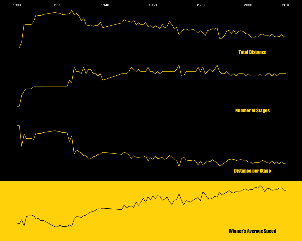
These first charts aim to show the evolution of the race settings overtime. The Total Distance has decreased, year after year, while the number of stages has increased, leading the Average Distance per Stage to decrease even more. This increased the energy the runners can deploy during a stage, improving the overall race speed.
# Total Distance per Year
plot_total_distance <- ggplot(tour_de_france, aes(x=Year, y=Total.distance..km.)) +
  geom_line(color = color3)+
  theme_minimal()+
  theme(panel.grid.major = element_blank(),
        panel.grid.minor = element_blank(),
        panel.border = element_blank(),
        axis.title = element_blank(),
        axis.text.y = element_blank(),
        axis.text.x = element_text(color = color2, family = font2),
        axis.ticks = element_blank(),
        plot.background = element_rect(fill = color1, color = color1),
        legend.position = 'None')+
  expand_limits(y = -(max(tour_de_france$Total.distance..km.)-min(tour_de_france$Total.distance..km.))*2/10+min(tour_de_france$Total.distance..km.))+
  annotate('text',
           label = 'Total Distance',
           family = font1,
           color = color3,
           x = max(tour_de_france$Year)-(max(tour_de_france$Year)-min(tour_de_france$Year))/8,
           y = -(max(tour_de_france$Total.distance..km.)-min(tour_de_france$Total.distance..km.))/10+min(tour_de_france$Total.distance..km.),
           size = 4)+
  scale_x_continuous(breaks = c(1903, 1920, 1940, 1960, 1980, 2000, 2016), position = 'top')

# Number of Stages per Year
plot_stages <- ggplot(tour_de_france, aes(x=Year, y=Number.of.stages)) +
  geom_line(color = color3)+
  theme_minimal()+
  theme(panel.grid.major = element_blank(),
        panel.grid.minor = element_blank(),
        panel.border = element_blank(),
        axis.title = element_blank(),
        axis.text = element_blank(),
        axis.ticks = element_blank(),
        plot.background = element_rect(fill = color1, color = color1),
        legend.position = 'None')+
  expand_limits(y = -(max(tour_de_france$Number.of.stages)-min(tour_de_france$Number.of.stages))*2/10+min(tour_de_france$Number.of.stages))+
  annotate('text',
           label = 'Number of Stages',
           family = font1,
           color = color3,
           x = max(tour_de_france$Year)-(max(tour_de_france$Year)-min(tour_de_france$Year))/8,
           y = -(max(tour_de_france$Number.of.stages)-min(tour_de_france$Number.of.stages))/10+min(tour_de_france$Number.of.stages),
           size = 4)

# Average Distance per Stage per Year
plot_distance_per_stage <- ggplot(tour_de_france, aes(x=Year, y=Distance_per_Stage)) +
  geom_line(color = color3)+
  theme_minimal()+
  theme(panel.grid.major = element_blank(),
        panel.grid.minor = element_blank(),
        panel.border = element_blank(),
        axis.title = element_blank(),
        axis.text = element_blank(),
        axis.ticks = element_blank(),
        plot.background = element_rect(fill = color1, color = color1),
        legend.position = 'None')+
  expand_limits(y = -(max(tour_de_france$Distance_per_Stage)-min(tour_de_france$Distance_per_Stage))*2/10+min(tour_de_france$Distance_per_Stage))+
  annotate('text',
           label = 'Distance per Stage',
           family = font1,
           color = color3,
           x = max(tour_de_france$Year)-(max(tour_de_france$Year)-min(tour_de_france$Year))/8,
           y = -(max(tour_de_france$Distance_per_Stage)-min(tour_de_france$Distance_per_Stage))/10+min(tour_de_france$Distance_per_Stage),
           size = 4)

# Winner's Average Speed per Year
plot_winner_avg_speed <- ggplot(tour_de_france, aes(x=Year, y=Winner.s.avg.speed)) +
  geom_line(color = color1)+
  theme_minimal()+
  theme(panel.grid.major = element_blank(),
        panel.grid.minor = element_blank(),
        panel.border = element_blank(),
        axis.title = element_blank(),
        axis.text = element_blank(),
        axis.ticks = element_blank(),
        plot.background = element_rect(fill = color3, color = color3),
        legend.position = 'None')+
  expand_limits(y = -(max(tour_de_france$Winner.s.avg.speed)-min(tour_de_france$Winner.s.avg.speed))*2/10+min(tour_de_france$Winner.s.avg.speed))+
  annotate('text',
           label = 'Winner\'s Average Speed',
           family = font1,
           color = color1,
           x = max(tour_de_france$Year)-(max(tour_de_france$Year)-min(tour_de_france$Year))/8,
           y = -(max(tour_de_france$Winner.s.avg.speed)-min(tour_de_france$Winner.s.avg.speed))/10+min(tour_de_france$Winner.s.avg.speed),
           size = 4)

# Plot
grid.arrange(plot_total_distance,
             plot_stages,
             plot_distance_per_stage,
             plot_winner_avg_speed,
             nrow = 4,
             ncol = 1)

3. Dumbbell
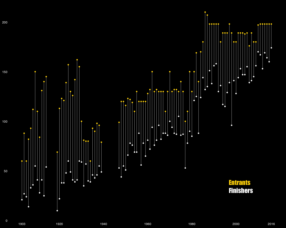
This chart compares the number of Entrants and the number of Finishers over time.
# Dumbbell Chart
ggplot(tour_de_france, aes(x=tour_de_france$Finishers,
                           xend=tour_de_france$Entrants,
                           y=tour_de_france$Year,
                           group=tour_de_france$Year))+
  geom_dumbbell(colour = color2, colour_x = color2,
                size = 0.2, colour_xend = color3, size_xend = 1, dot_guide=FALSE, size_x = 1)+
  labs(x=NULL, y=NULL)+
  theme_tufte()+
  theme(axis.text.y = element_text(colour = color2, size = 8, family = font2),
        axis.text.x = element_text(colour = color2, size = 8, family = font2),
        axis.ticks = element_blank(),
        plot.title = element_text(color = color3, size = 14),
        plot.background = element_rect(fill= color1)
  )+
  scale_y_continuous(breaks = c(1903, 1920, 1940, 1960, 1980, 2000, 2016))+ coord_flip()

# Titles
spacing <-10
grid.text(unit(0.8, 'npc'), unit(0.165,"npc"), check.overlap = T,just = "left",
          label="Finishers",
          gp=gpar(col=color2, fontsize=16,fontface="bold", fontfamily = font1))
grid.text(unit(0.8, 'npc'), unit(0.2,"npc"), check.overlap = T,just = "left",
          label="Entrants",
          gp=gpar(col=color3, fontsize=16,fontface="bold", fontfamily = font1))

4. Waffle
This chart shows the proportion of wins for the top 3 countries. Other countries have been groups under the label Others.
# Waffle Data Preparation
winners_nationality <- as.character(tour_de_france$Winner.s.Nationality)
winners_nationality[!(winners_nationality %in% c('France', 'Belgium', 'Spain'))] <- 'Others'
nrows <- 10
df <- expand.grid(y = 1:nrows, x = 1:nrows)
categ_table <- round(table(winners_nationality) * ((nrows*nrows)/(length(winners_nationality))))
categ_table <- categ_table[c(2,1,4,3)]
df$category <- factor(rep(names(categ_table), categ_table))

# Plot
ggplot(df, aes(x = x, y = y, fill = category)) +
  geom_tile(color = "black", size = 0.5) +
  scale_x_continuous(expand = c(0, 0)) +
  scale_y_continuous(expand = c(0, 0), trans = 'reverse')+
  scale_fill_manual(values = c('orange', 'gold1', 'darkorange4', 'darkorange3'),
                    breaks = c('France', 'Belgium', 'Spain', 'Others'),
                    labels = c('France', 'Belgium', 'Spain', 'Others')) +
  theme(title = element_text(),
        legend.position = 'right',
        legend.background = element_rect(fill = 'black'),
        legend.key = element_rect(fill = 'black', color = 'black'),
        legend.box.background = element_rect(fill = 'black', color = 'black'),
        legend.title = element_blank(),
        legend.text = element_text(margin = margin(r = 10), color = 'white', family = font2),
        legend.spacing.x = unit(5,'pt'),
        axis.text = element_blank(),
        axis.title = element_blank(),
        axis.ticks = element_blank(),
        panel.background = element_rect(fill = 'black', color = 'black'),
        plot.background = element_rect(fill = 'black', color = 'black'),
        plot.margin = unit(c(5.5, 5.5, 50, 5.5),'point'))
grid.text(unit(0.68, 'npc'),
          unit(0.05,"npc"),
          check.overlap = T,
          just = "left",
          label=paste(paste(rep(" ",spacing), collapse=''),"Wins per Country"),
          gp=gpar(col=color3, fontsize=16,fontface="bold", fontfamily = font1))

5. Small Multiple with Tufte Theme
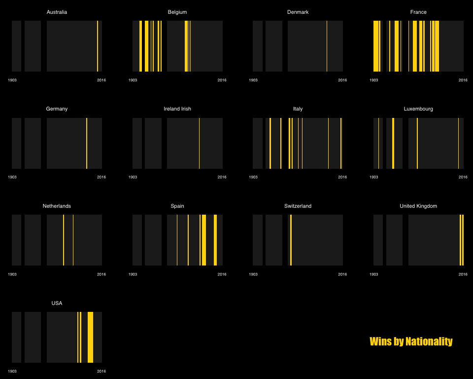
These charts show on which Years each Nationality has won the competition.
# Data for Grey Background Data
tdf_no_nationality <- tour_de_france[,c('Year', 'Winner.s.avg.speed')]

# Plot
ggplot(tour_de_france, aes(x = Year, y = 1))+
  geom_bar(data = tdf_no_nationality, stat = 'identity', alpha = 0.1, fill = color2,width = 1)+
  geom_bar(stat = 'identity', fill = color3, width = 1)+
  facet_wrap( ~ Winner.s.Nationality, scales = 'free')+
  scale_x_continuous(breaks = c(1903, 2016))+
  theme_tufte(ticks = FALSE, base_size = 15)+
  theme(axis.text.y = element_blank(),
        axis.text.x = element_text(color = color2, family = font2, size = 6),
        panel.grid.major = element_blank(),
        panel.grid.minor = element_blank(),
        axis.title = element_blank(),
        plot.background = element_rect(fill = color1),
        strip.text = element_text(color = color2, family = font2, size = 8),
        panel.spacing = unit(2, 'lines'))
spacing <-10
grid.text(unit(1, 'npc'), unit(0.1,"npc"), check.overlap = T,just = "right",
          label=paste("Wins by Nationality",paste(rep(" ",spacing), collapse='')),
          gp=gpar(col=color3, fontsize=16,fontface="bold", fontfamily = font1))

6. Box Plot with Tufte Theme
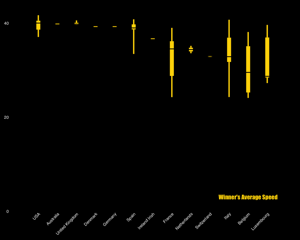
This plot shows the distribution of Winner’s Average Speed by Nationality.
ggplot(tour_de_france,
       aes(x = reorder(factor(Winner.s.Nationality), -(Winner.s.avg.speed), median), Winner.s.avg.speed)) +
  theme_tufte(base_size = 5, ticks=F) +
  geom_tufteboxplot(outlier.colour = color3,
                    color= color3,
                    size = 1.5,
                    median.type = 'line',
                    whisker.type = 'line',
                    hoffset = 0,
                    width = 3) +
  theme(plot.margin = unit(c(10,10,10,10),'pt'),
        axis.title=element_blank(),
        axis.text = element_text(colour = color2, family = font2, size = 10),
        axis.text.x = element_text(angle = 45, hjust = 1, size = 10),
        plot.background = element_rect(fill = color1))+
  scale_y_continuous(expand = c(0, 0), limits = c(0,44), breaks = seq(0, 50, by = 20))+
  annotate('text', label = "Winner's Average Speed", family = font1, color = color3, x = 12, y = 3, size = 5)

Conclusion
After using a variety of charts, the following insights can be drawn. Over the past century, the Tour de France has become more of a sprinting exercise, with shorter average distance and increased average speed. What’s more, while Belgium and France have typically had the highest number of wins, other nations have more recently claimed the Maillot Jaune, including the USA, Spain, and the UK. Particularly, winners from the the USA, Australia and the UK have outperformed other nations on average speed, by maintaining an average speed of 40 km per hour throughout the race.
